Systems at scale

The Property Card, rebuilt

Redesigning the most-viewed surface at Zillow, where every pixel had an executive opinion attached.

RoleDesign lead
TeamSenior designer, DS engineer, design technologist, content strategist, researcher
Duration~1 year to recommendation
StatusBeing built into our design system; first cards live (rentals community)

Property cards are the first impression of a home. Their job is to showcase its most important qualities and tell a shopper whether this one might be “the one.”

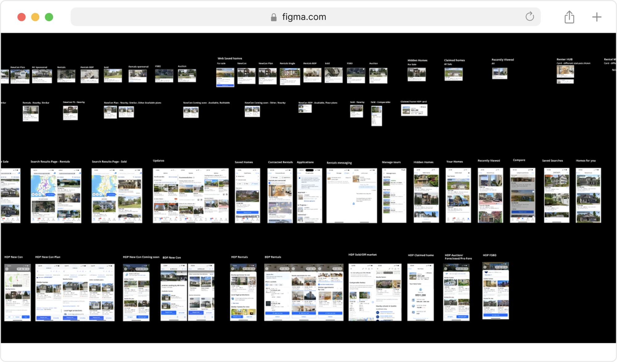
Zillow's primary property card surfaces take over 130 million visits a month — more than 1.5 billion a year. Talk about impact!

Scroll to see the full matrix →

The full property card matrix. For Sale spans house, townhouse, condo, manufactured, lot/land, auction, foreclosure, new construction, FSBO, Showcase and multi-unit building; For Rent spans apartment, house, condo, room and multi-unit building. Each type is drawn in four layouts: large, small, horizontal and map view.
One system, every type and every layout.

Context

At the start of this project, we had new business needs and capabilities that needed a place to live on our property cards. Once we clearly documented the problems and aligned on future goals with leadership, I led the rebuild with a team of five amazing colleagues under my direction: a senior designer, a design systems engineer, a design technologist, a content strategist and a principal researcher. We worked across many orgs and consulted with legal, the brand team, and had regular meetings with our head of design to keep this work at the highest levels of quality and visibility. The work took nearly a year of testing and revision before we had a recommendation that held up across every surface, and the work paid off with a comprehensive system being implemented and governance that will outlive this project alone.

01 — Discovery
Cross-surface inventory, MLS data audit, mapping needs with partner teams.
02 — Framing
Rewrote the brief from "redesign a card" to "create the Property Preview System."
03 — Explore & test
Divergence, visual experimentation, live prototypes in real research.
04 — Spec & govern
Design system specs, 30-page governance doc with C-suite buy-in.

Defining the problems

Before proposing anything, I wanted the existing problems we were trying to solve clearly defined — I knew we were about to do a whole lot more than just "make room for new business needs." Here's what we found:

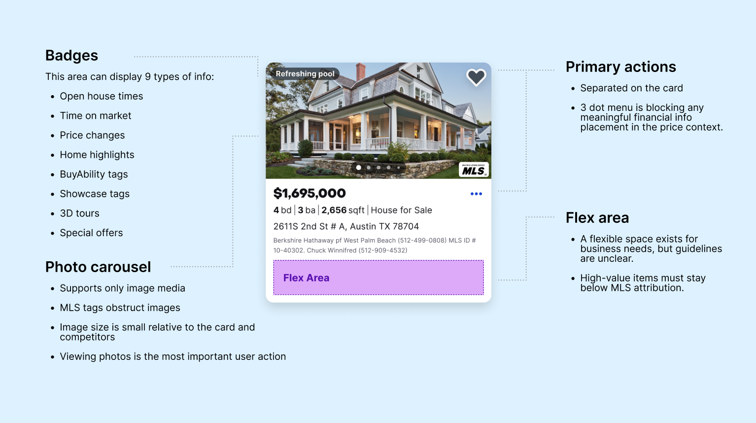
The property card audit summary. Key takeaways: complex badge logic — overly complex logic in the photo carousel; inconsistencies — Constellation components misused across platforms; no space for personalization — no dedicated space for personalized content; limited media support — no built-in way to showcase new media types. Alongside, a collage of live property cards in production: for-sale listings, a third-party ad unit, a school card, a rentals card with unit pricing, and a sponsored listing.
The audit, and the four gaps it surfaced. Every card type running in production, pulled together in one place — for sale, for rent, ads, schools, sponsored placements. Seeing them side by side is what turned "the card needs new features" into four specific, nameable problems.

Extensive cross-platform audit

Cataloged every surface the card appears on and every variant running in production: search, map, collections, saved homes, email, recommendations, partner placements.

What it foundInconsistencies across platforms because design system components aren't being used properly — no one owns governance and quality standards.

Behavioral data audit

I worked with analytics to see where action actually went: what got tapped, how engagement differed by surface and listing type.

What it foundThe photo carousel received high engagement and positive metrics, and the save action was our #1 signal of intent — yet both elements were missing from key surfaces.

Constraint mapping with partners

Interviewed every team whose data lands on the card: legal and MLS compliance, ads, personalization, brand, and engineering leads across the Search team.

What it foundThere were a lot of hard constraints that varied by market, and a big issue with the flex badge logic.

Best practices evaluation

We used mixed methods of tenets and traps and heuristics, and had our IA team evaluate the hierarchy.

What it foundThe visuals were inconsistent and not up to our quality bar, our information hierarchy did not reflect the user's mental model, and there was no space for new features.

Reframing the work and aligning with leadership

What started as "redesign the property card" turned into a journey-based, all-surface and platform system creation project. We started to paint a vision of how the card could reflect what we understand about a user over time, and how we can tie in our business offerings at the right moments.

The vision, in one card. Two ideas doing the work at once: the card knows something about this shopper, and it earns the right to sell. "Under target" reads their budget rather than just stating a price, and the chips name the three things this person is looking for. Then the same card opens into a full-screen agent video — a business offering placed where a shopper has already shown interest, instead of interrupting to get it. (Persona and listing details are prototype placeholders.)

Exploring all the design directions

We explored hundreds of combinations of visual stylings, badgings, buttons, hierarchy, sizes, and more. We leveraged foundational research to give us a new hierarchy based on card sorting and prioritizing jobs to be done.
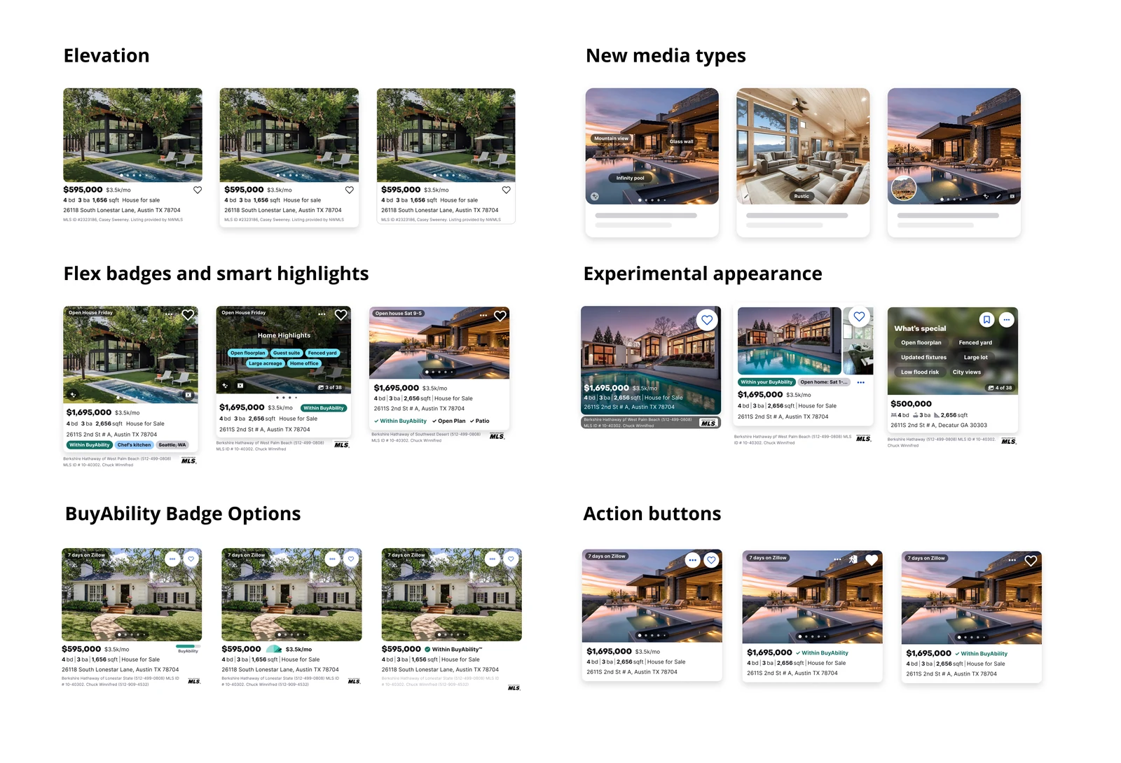
Six sets of property card explorations, three variants each. Elevation: the same listing with increasing shadow and card lift. New media types: cards with feature tags over the photo, an interior shot, and a picture-in-picture video thumbnail. Flex badges and smart highlights: open house labels, a Home Highlights overlay with chips like open floorplan and guest suite, and a checklist of Within BuyAbility, Open Plan and Patio. Experimental appearance: price and facts overlaid directly on the photo, a split image layout, and a dark What's special card listing features. BuyAbility badge options: three treatments of the affordability indicator, from a bar to a chip to an inline check. Action buttons: variations in the save heart and overflow menu placement.
Six variables, explored separately. Elevation, media, badging, appearance, the BuyAbility indicator and the action buttons — each one varied on its own rather than as competing whole-card designs. Pulling them apart meant critique could stay specific: we were never arguing about which card looked better, only about one variable at a time. (Sample listing data.)

Testing in Zillow sandbox environments

Our design technologist built the leading concepts into a live sandbox, a year before vibe-coding tools made interactive prototypes easy. That let us put working cards in front of people and watch what they did with them: how fast they could tell two homes apart, which one they chose to open, what they thought a label meant, and what they made of more ambitious concepts like progressive disclosure on hover or dwell.
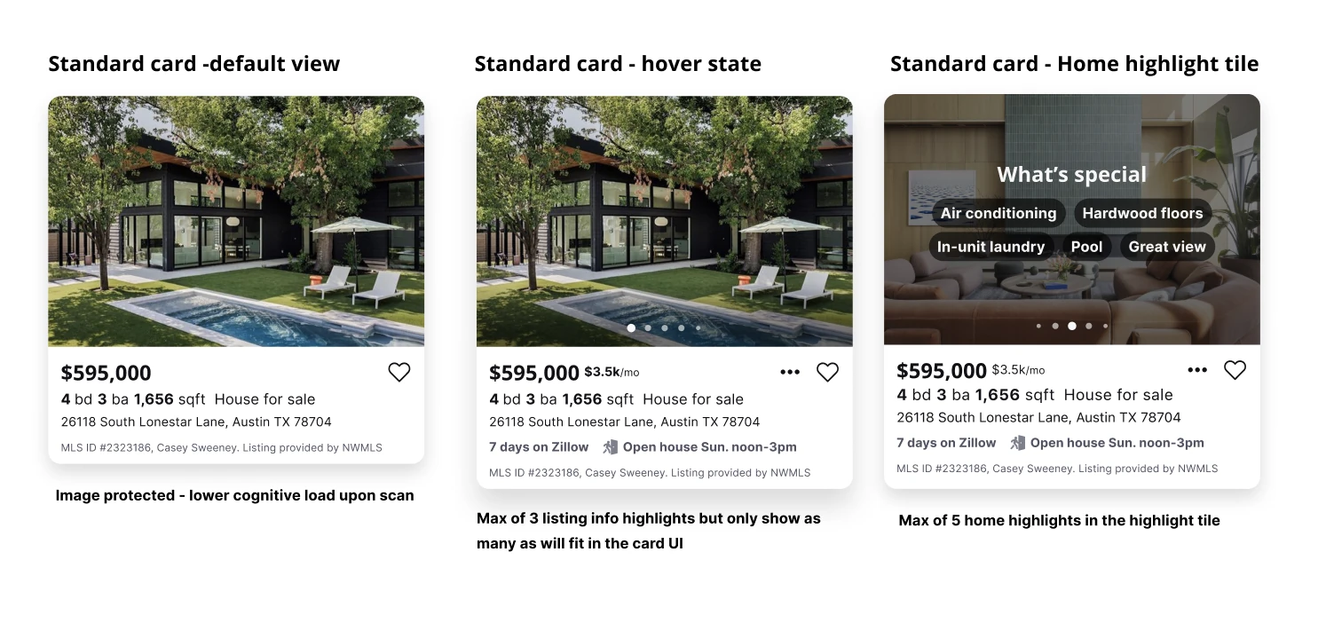
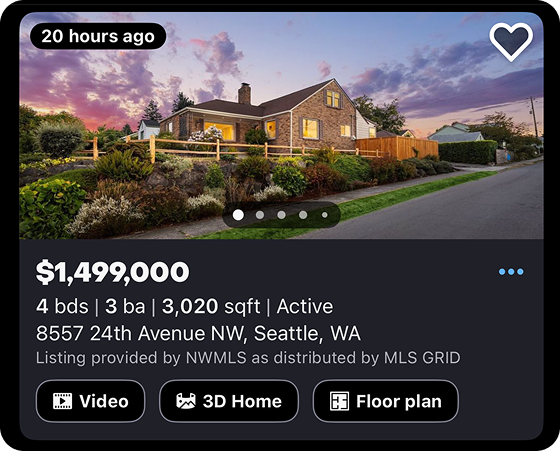
Three states of the standard card side by side. Default view: photo, price, beds, baths, square footage, address and MLS attribution, annotated 'image protected — lower cognitive load upon scan'. Hover state: the same card gains a monthly cost beside the price, carousel dots, an overflow menu, and a row of listing info highlights reading '7 days on Zillow' and 'Open house Sun. noon–3pm', annotated 'max of 3 listing info highlights but only show as many as will fit in the card UI'. Home highlight tile: a later carousel frame overlaid with a 'What's special' panel of feature chips — air conditioning, hardwood floors, in-unit laundry, pool, great view — annotated 'max of 5 home highlights in the highlight tile'.
Progressive disclosure, and the rules that bound it. The default card stays deliberately quiet — the photo does the work and the scan stays cheap. Detail arrives on hover, and the "what's special" tile waits until someone is already moving through the carousel. The annotations are the part that had to survive contact with engineering: a hard cap of three listing highlights, five home highlights, and a rule that the card shows only as many as actually fit rather than reflowing around them. (Sample listing data.)

What we built

The Property Preview System is now part of Zillow's design system. It is being launched and built incrementally as new technology becomes available and as time allows:

  • Larger image areas and new rich-media ingress points
  • AI-driven personalization
  • New mini map cards
  • A rebuilt information hierarchy that survives every surface the card lives on
  • Dynamic next-best-action buttons that adapt to the surface and the user's phase of journey
  • A more accessible save button and more menu
  • Space for price or affordability details
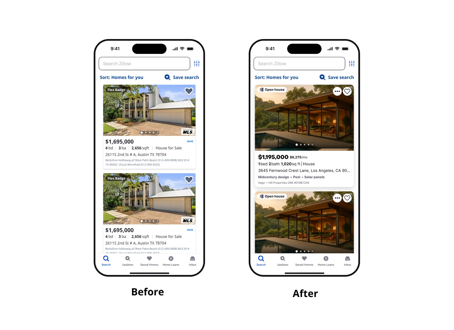
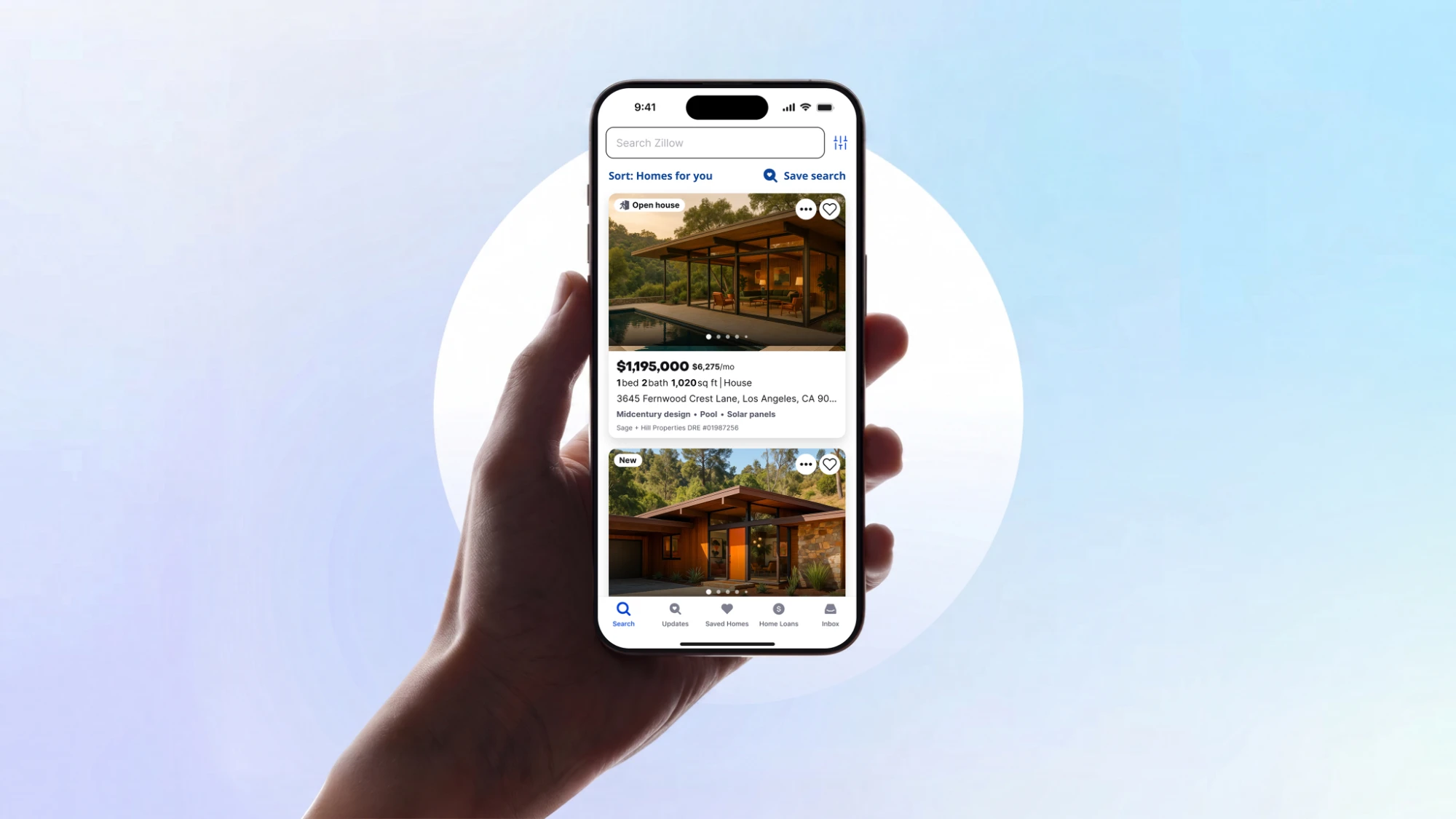
Before and after of the Zillow search feed on mobile. Before: a generic Flex Badge, an MLS logo over the photo, and two dense lines of broker and license text. After: an Open house status, a monthly cost beside the price, personalization chips, and a single quiet attribution line.

The rigor underneath

A card that has to work on every surface, in every market, for every listing type and in every phase of the journey required a lot of systems thinking and content strategy. Here, we've documented the high level anatomy of a basic card:
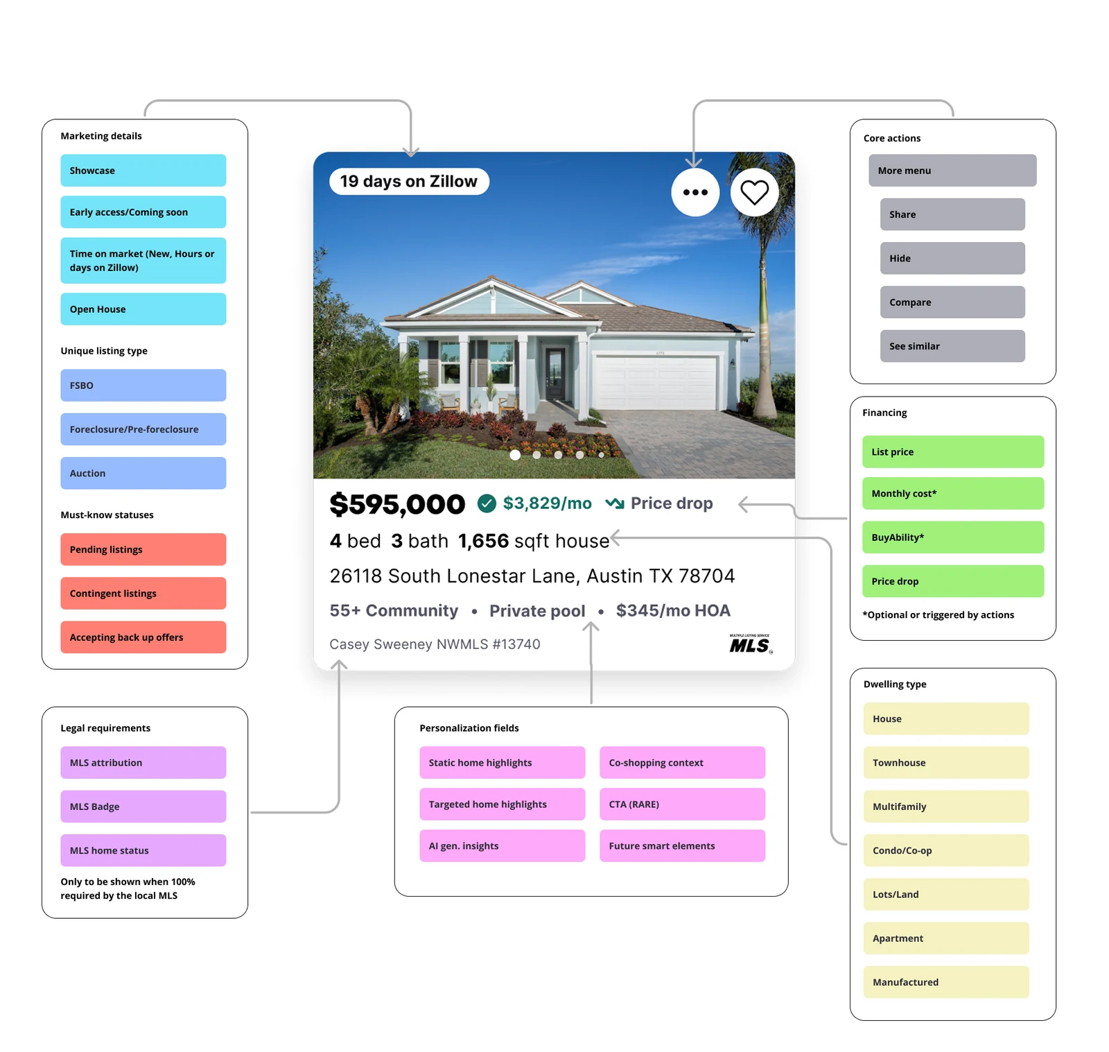
Anatomy diagram of the property card, mapping every element to a logic group: marketing details, unique listing types, must-know statuses, legal requirements gated by MLS rules, personalization fields including AI-generated insights and future smart elements, core actions, financing states, and dwelling types.
The card as a rules system, not a layout. Every element belongs to a logic group with display conditions: legal marks appear only where the local MLS requires them, financing states are triggered by user actions, and the personalization group reserves slots for AI-generated insights and "future smart elements": extension points designed for capabilities that didn't exist yet. This is what made one card survive every surface.

Pushing back for our users

The business wanted agent faces on the card as a form of advertising on premium listings, but I knew that this would not serve our customers' primary goal of understanding if a home they found fits their needs. They want to see the details and the media, not a stranger's face. As an alternative, I proposed a premium card that had a large agent card and contact button at the very end of the photo carousel. The premium listing team agreed to this proposal and were even more excited at the other solutions we brought to the table with videos and rich media in the cards.

The rich-media journey, prototyped end to end. The Showcase card opens into a full-screen vertical stream — a social pattern, presented by the listing agent — then back through the photo carousel and on into 3D Home and SkyTour, with its "go inside" and "see from street" hotspots. The agent appears in exactly one place: the final position of the carousel, after a shopper has swiped past everything else. Media first, people at the moment they're wanted. (Persona and listing details are prototype placeholders.)

Where it stands

I would call this project a success! My team handled the problem definition, redesign, information hierarchy, logic revision, new elements and business needs, and user testing. The design systems team now owns implementation and is building the card into the component library.

The first pieces are live. The rentals community cards are in production, and the premium video cards launch soon.

I authored a 30-page governance document for the Property Preview System, anchored by five principles we call CLASS: Clarity, Look & Feel, Accessibility, Structure, and Scalability. It earned C-suite buy-in as persistent governance for property cards going forward, and was adopted as-is by the design systems team.
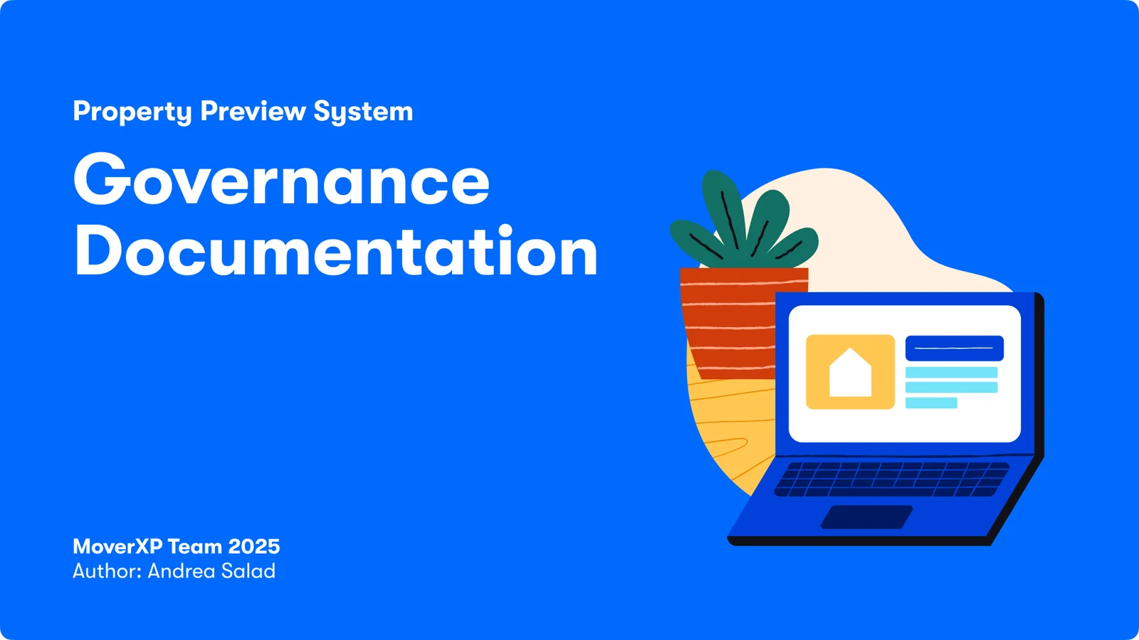
Cover of the Property Preview System governance documentation, authored by Andrea Salad for the MoverXP team, 2025.

The five principles — scroll →

Clarity: legible and scannable — organizes information with clear hierarchy for quick comprehension; optimize insights and actions — strategically place CTAs and insights for engagement without overwhelm. Look and Feel: hero the image — keeps the listing's image as the focal point while avoiding clutter; visual refresh aligned — reflect our brand evolution while keeping the design clean and modern. Accessibility: prioritize inclusivity — ensure all users can engage with the platform; accessibly embedded at the forefront — support dynamic text scaling, color vision needs, and screen readers. Structure: ensure consistent and unified design — prevent fragmentation and build trust through a clear, single source of truth; establish hierarchy — highlight key details and ensure the information is easy to scan at a glance. Scalability: provide personalized information — surface the most relevant details without cluttering the design; flexible to adjusting needs — accommodates evolving content types and business needs well into the future.
The constitution and its five articles. Thirty pages of governance, endorsed by the C-suite as the persistent standard for the card. CLASS gives every future decision a shared test: Clarity, Look & Feel, Accessibility, Structure, Scalability. Note Scalability's second clause — "accommodates evolving content types and business needs well into the future." The extension slots in the anatomy above are that principle, enforced.
What I'd do differently

This work sat on a shelf longer than it should have, because as a design lead on a product-led team I didn't yet understand how to get work prioritized and built without a product partner. I eventually got it moving by convincing the design systems team to adopt it as a component change, but the real lesson was learning to treat prioritization as part of the design problem, not something that happens to the design afterward. I now build the path-to-ship into the work from day one!