Turning Favorites from a static bookmark into a decision engine: from ambiguous, unowned problem space to SLT-endorsed roadmap in six weeks, using object-oriented UX and AI as a genuine force multiplier.
RoleTeam lead, save & return engagement
Timeline6 weeks, ambiguity → funded roadmap
Status3 of 7 workstreams kicked off
Context
Favorites, the saved homes at the heart of Zillow's save-and-return loop, needed a vision, and nobody had one. Product was largely unopinionated about the space; the problem definition itself was up for grabs. And like everything at Zillow, the surface touched many teams, which meant any real vision would have to work across multiple organizations, not just mine.
I was asked to create that vision. I gave myself six weeks.
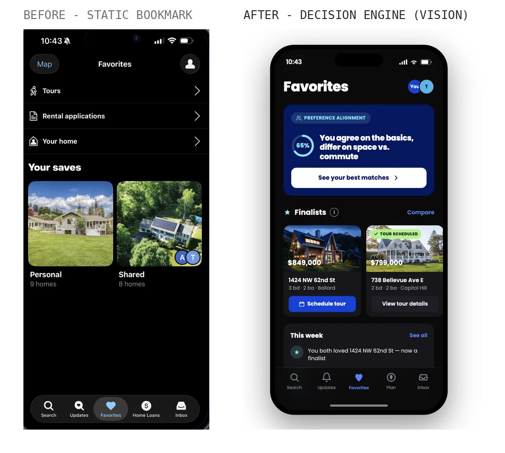
The starting point, and where the vision takes it. The before is a junk drawer: tours, rental applications, and “your home” crowding the top, objects the OOUX mapping later formally evicted (the gray notes on the model literally say they don’t belong here), above two undifferentiated buckets of saves. A bookmark, holding things. The vision replaces holding with deciding.
How I ran it
I drove the foundation personally: problem definition, success metrics, the first rounds of research, and AI-built prototypes that got real feedback in front of users fast. With that foundation solid, I brought in senior and principal teammates for object-model mapping workshops and principles creation, then ran a final round of moderated studies to pressure-test the direction.
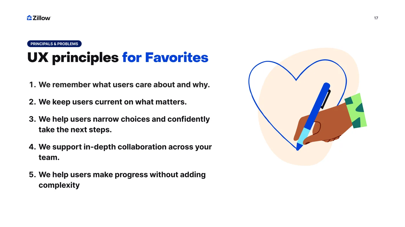
Five principles from the workshops. Written as promises to the user, not rules for the team: “we remember what users care about and why.” Every one of them is testable against the object model: remembering requires notes as objects, currency requires notifications, narrowing requires compare. Principles and model were built to check each other.
The methodological bet was object-oriented UX. Partnering with the IA team, I mapped the actual objects in the space (homes, collections, searches, the relationships between them) before designing any screens. That model, not the mockups, is what made the vision durable: it gave every team touching the surface a shared vocabulary, and it's now rippling across the design org as an emerging standard.
Screens are opinions. Object models are agreements. Agreements are what survive contact with seven workstreams and three orgs.
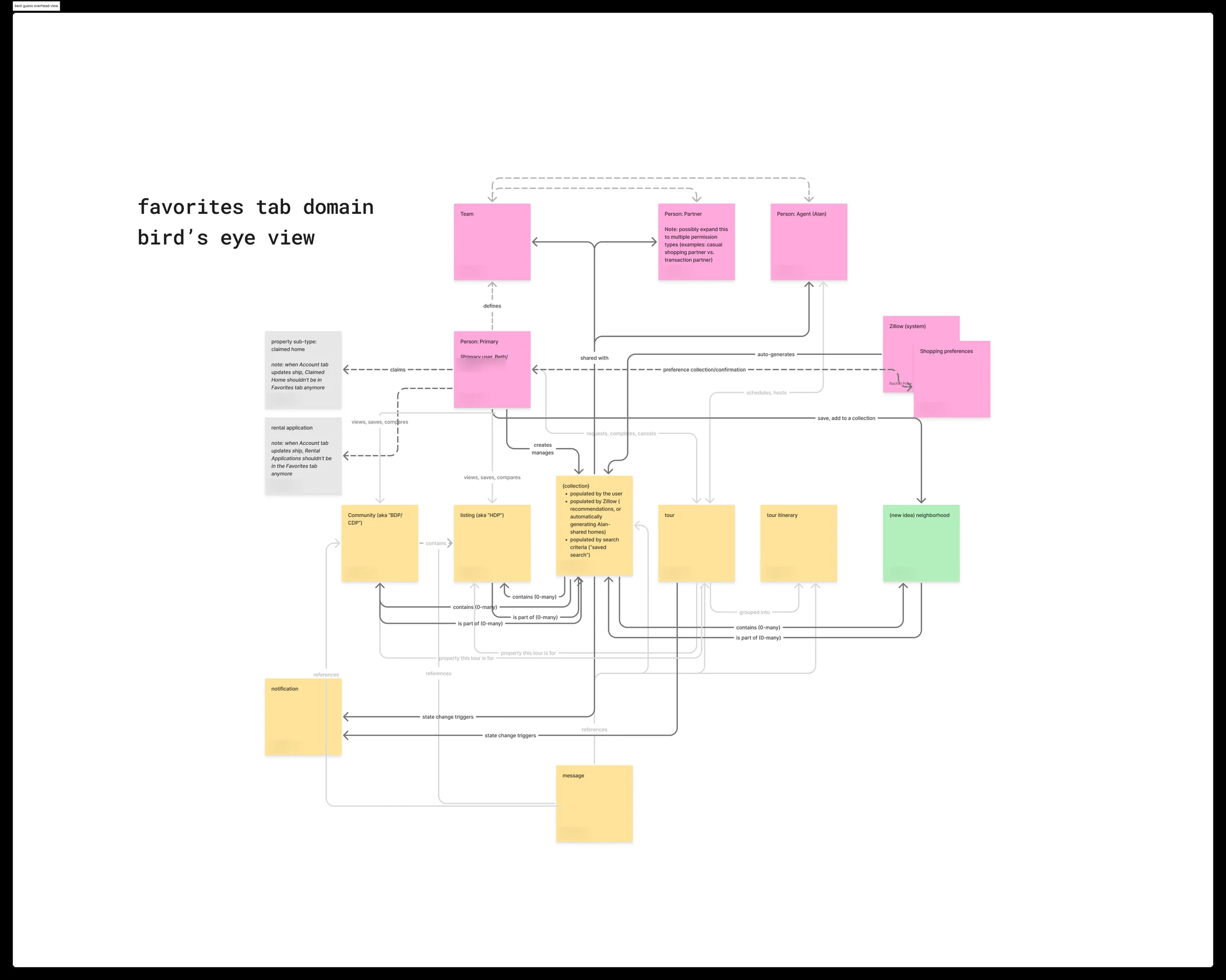
The object model, bird’s eye. The actual working map from the OOUX sessions: every object in the favorites domain (people, collections, listings, tours, messages) with its relationships made explicit, down to cardinality (“contains 0–many”) and policy questions captured as notes on the objects themselves. The green sticky marks a new idea born from the mapping: neighborhoods as a first-class saved object. This artifact, not any mockup, is what seven workstreams agreed on.
From model to evidence
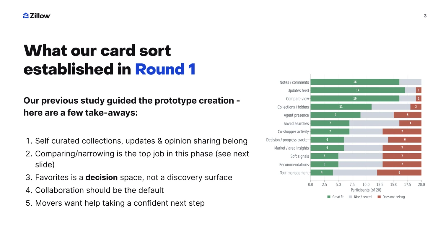
With the model and principles set, research told us where to drive. A first-round card sort with 20 high-intent movers established the strategic frame in one sentence: Favorites is a decision space, not a discovery surface. Comparing and narrowing ranked as the top job of the phase (4.9 out of 5), collaboration should be the default (but adapt to solo shoppers), and users decisively voted features like vague recommendations and tour management off the island, including, notably, agent presence.
Round 1: the card sort that set the frame. Twenty high-intent movers sorted candidate features into belongs / neutral / doesn’t belong. Notes, updates, and compare won decisively; tour management and vague recommendations lost. And a quiet echo of the property card work: “agent presence” drew the strongest “does not belong” votes of the top candidates.
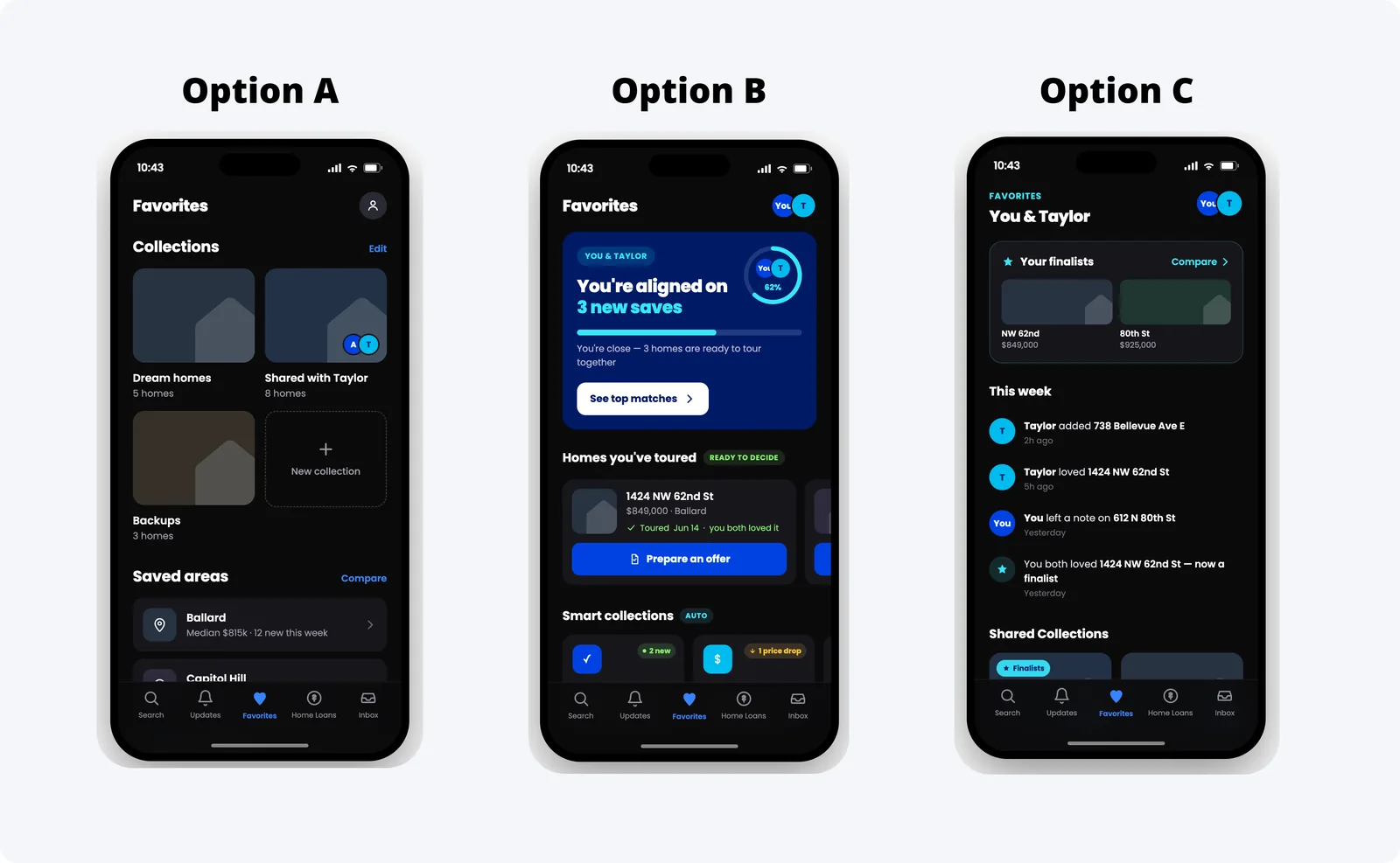
Three concept directions then went in front of users in moderated studies, ranging from a familiar collections-first organizer to a fully collaborative decision hub built around alignment between co-shoppers.
The three directions we tested. A: collections-first, the familiar organizer evolved. B: an alignment hub (“you’re aligned on 3 new saves”) built around co-shopper agreement and smart collections. C: an activity stream with finalists, notes, and a shared timeline. All three treat collaboration as the default, per Round 1; the question was how strongly to center the decision itself. (Personas are fictional.)
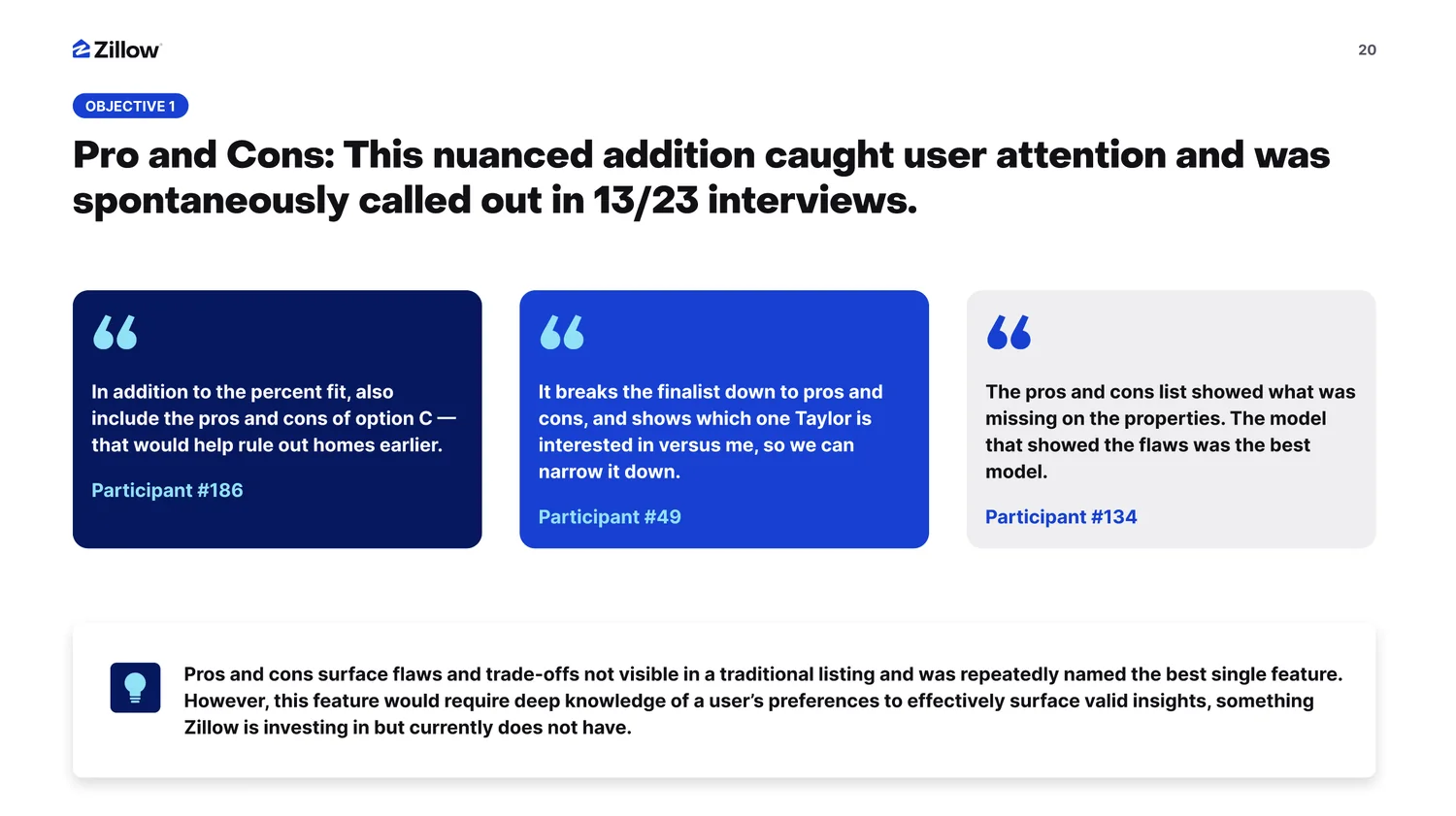
The moderated round produced the vision’s most energizing finding: a pros-and-cons feature that surfaced each home’s trade-offs was spontaneously praised in 13 of 23 interviews. “The model that showed the flaws was the best model,” as one participant put it. It also produced the most honest one: doing pros and cons well requires a depth of preference understanding Zillow is still building. That dependency didn’t kill the feature; it became a named workstream on the roadmap, sequenced for when the capability lands.
The finding, and its honest fine print. Users didn’t just like pros and cons; they trusted the product more for showing flaws. The insight box carries the part most decks would omit: the feature needs preference depth the company doesn’t have yet. Naming the gap is what let us sequence it instead of shipping it badly.
AI as force multiplier — with receipts
Six weeks was only possible because I used AI aggressively: to teach myself unfamiliar territory, to enhance the thinking, and to compress prototyping from weeks to days. But I used it with two non-negotiable rules. First, I verified sources: AI accelerated my research; it never replaced my judgment about what was true. Second, I labeled what was AI-made when sharing it, because the fastest way to burn a team's trust in AI-augmented work is to let them discover the provenance themselves.
That transparency turned out to be a feature, not a disclaimer. It modeled a way of working that colleagues could adopt without feeling deceived by it.
Outcome
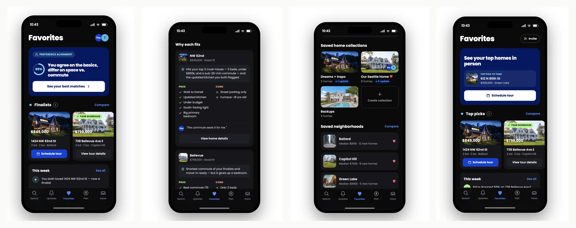
Six weeks in, we had a tested vision, a shared object model, design principles, and a six-month roadmap that sequenced the work and named exactly when we'd need dependency-creating teams. The vision in one sentence: turn Favorites from a static bookmark into a decision engine, for solo shoppers and co-shoppers alike. Product and SLT bought in, and three of the seven workstreams have already kicked off.
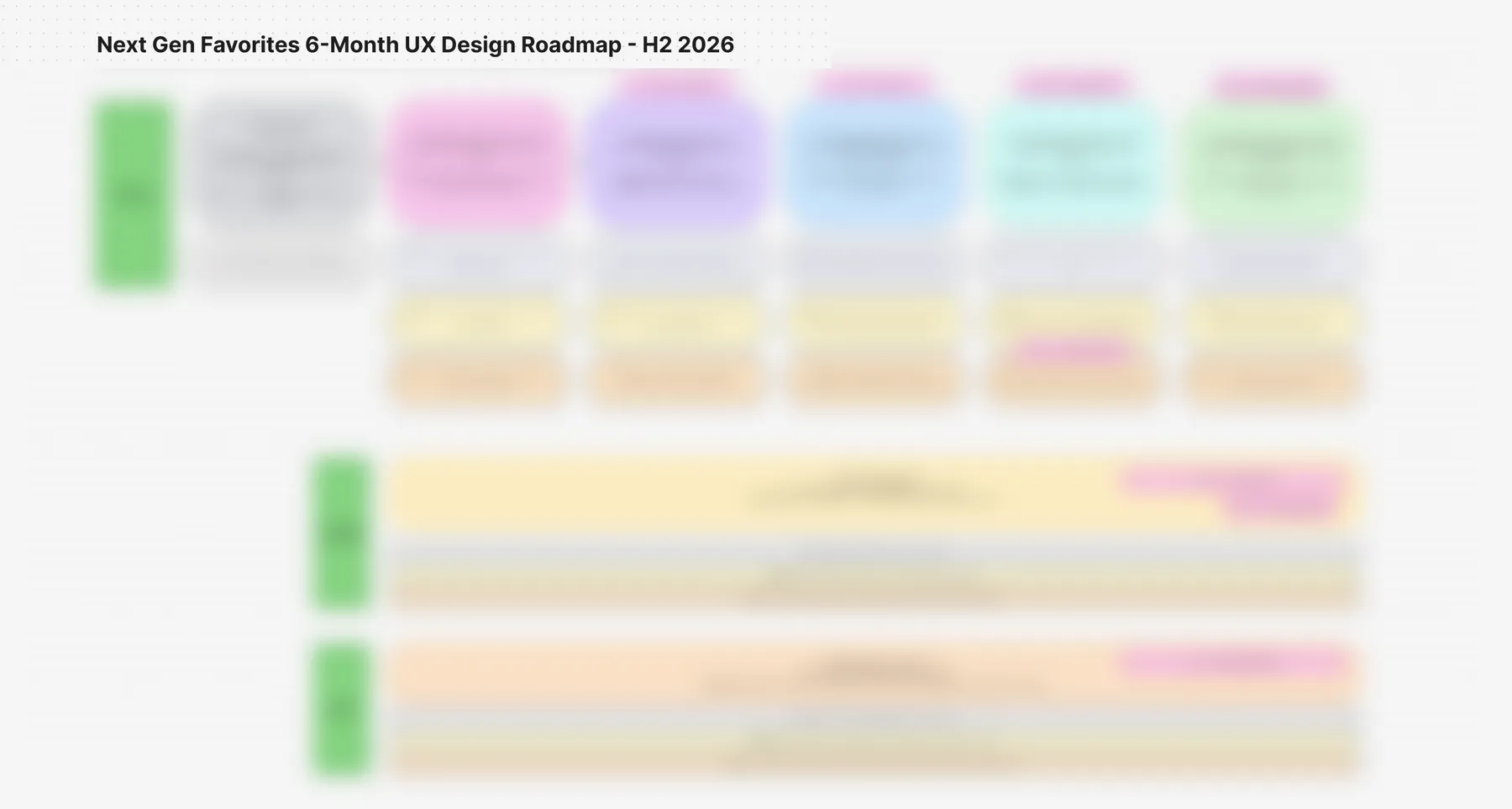
The vision, end state. Everything the research demanded, in one surface: preference alignment between co-shoppers (“you agree on the basics, differ on space vs. commute”), a “why each fits” view pairing percent fit with the pros-and-cons pattern users loved, and collaboration as the default with a graceful solo variant. And in the third frame: saved neighborhoods, the green “new idea” sticky from the object model, now a first-class feature. (Personas and data are fictional.)The roadmap: shape shown, contents deliberately withheld. Seven hypothesis-driven workstreams across three owner lanes, each deliverable pre-sized in light / medium / heavy tiers so leadership could trade scope against conviction, with dependencies on partner teams flagged as first-class objects on the plan. The specifics are my employer’s; the structure is the point: a vision isn’t real until it’s sequenced, sized, and honest about what it needs from others.
Why this matters to meThis is what I think senior design leadership looks like right now: owning the ambiguous front of the problem personally, multiplying yourself with AI honestly, and leaving behind a model, not just mockups, that other teams can build on without you in the room.